
Exploring pg_stats
March 2025
Background - Learning PostgreSQL
This year, I taught a databases course using PostgreSQL. One of my goals for this class was to emphasize how databases work "under the hood" and to emphasize that it's important to understand exactly how your chosen RDBMS works in order to get the most out of it.
This was challenging because I don't have a lot of experience with PostgreSQL - my background is primarily with Microsoft SQL Server, so transitioning to PostgreSQL came with some surprises. For example, I learned that PostgreSQL doesn't have clustered indexes and doesn't show its spool operations in query plans (it does materialize intermediate results, but I was caught off guard mid-lecture about the Halloween Problem when I couldn't find any sign of this in the query plan). I also played with SQLite for this class, and learned that it ignores length constraints when creating varchar columns.
Cardinality Estimation
I spent a lot of time going down one specific rabbit hole related to PostgreSQL's cardinality estimator. A lot of this investigation was inspired by this this blog post: 'Statistics: How PostgreSQL Counts Without Counting'. That article is a fantastic introduction to the topic of cardinality estimation, so I won't reiterate the fundamentals here. The TL;DR is that most RDBMS, including PostgreSQL automatically track the distribution of values in each column, and this distribution informs a lot of decisions in the query plan (Also see these examples from the official documentation here). There are a lot of situations where this tracking can go wrong (usually by not getting updated to reflect major changes in the data), which can result in poor decisions (eg choosing the wrong join operator, which can have a huge impact on runtime).
In one specific example in that article, they produce a table like this:
create table t(n)
  with (autovacuum_enabled = off)
  as select generate_series(1, i)
     from generate_series(1, 1000) as i;
This produces a table with this distribution:
| value | count |
|---|---|
| 1 | 1000 |
| 2 | 999 |
| 3 | 998 |
| ... | ... |
| 1000 | 1 |
They do a lot of interesting analysis on this table, which leads up to creating a histogram, using this query on pg_stats.
select
histogram_bounds::text::int[] as histogram_bounds
from pg_stats
where tablename = 't';
This all felt very straight-forward so far.
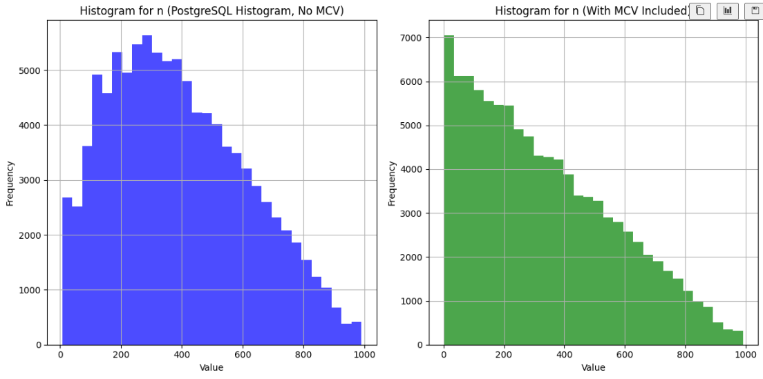
I wanted to visualize this histogram for a slide in my class, so I wrote some Python code to ingest this histogram, and it turned out like this:
But when I ran my code, the result was unexpected:
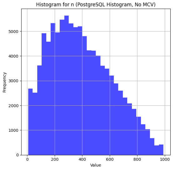
... hm, that's not right!
There's clearly a lot of data missing from the left side. Interestingly, the cardinality estimates that use this histogram are not wrong. Here's a query where I used a helpful UDF described in the original post to show the estimates:
select * from c('select * from t where n < 100;');
And here's the output:
| scan | estimate | actual |
|---|---|---|
| Seq Scan | 93085 | 94149 |
At first, I was positive that there was something
wrong with my visualization code. I spent a long time staring at it before I
convinced myself that the code was right and there was something wrong with
my understanding of pg_stats.
I did some digging in the official documentation and reached out to
Sadeq Dousti (the author of the original post) for help understanding what was going on here.
MCV's - The Missing Ingredient
It turns out that PostgreSQL actually has a few structures that help inform estimates - in this case, we need to look at a table of 'Most Common Values' (MCV's) to get the whole picture.
The MCV structure keeps track of the values that appear with the highest frequency, along with their frequency. Here's the MCV values for our table:
SELECT most_common_vals, most_common_freqs
FROM pg_stats
WHERE tablename = 't' AND attname = 'n';
Here's the first few of MCV's
{46,18,32,1,129,...}
And their frequencies:
{0.0025333334,0.0024,0.0024,0.0023666667,0.0023666667,...}
These two lists map one-to-one (Each value in most_common_vals corresponds directly to the frequency at the same position in most_common_freqs), so looking at the first value in each list we
can see that the value 46 appears with frequency 0.0025333334. Note that these
aren't exact - we know that 1 is actually a lot more frequent than 46. Like the histogram, they are based on a random sample of the data (which you can sort of control with default_statistics_target, but the exact math there is a little more complicated that you'd expect).
It turns out that MCVs are excluded from the histogram. And the table proposed in that blog post is actually a perfect example to demonstrate this logic - the most common values are very common!
One Solution - Minimize the impact of the MCVs
Sadeq wrote a follow-up blog post that solved this problem by adding a small random adjustment to the values in the table. Here is their modified version:
create table t(n)
  with (autovacuum_enabled = off)
  as select generate_series(1, i) + random() / 1000.0
  from generate_series(1, 1000) as i;
This certainly does make the MCVs less common, and results in a nice histogram. But I wanted to go a step further and make a visualization that reproduces PostgreSQL's actual logic.
Combining histogram_bounds with MCVs
I kept the original version of the table (without the randomization described above), and generated an updated version that incorporates both the MCVs and histogram_bounds.
Here's the result:
It looks much better!
RTFM
I could have just read the documentation. There's a great explanation of this logic in the docs:
For a non-unique column, there will normally be both a histogram and an MCV list, and the histogram does not include the portion of the column population represented by the MCVs. ...[PostgreSQL] adds up the frequencies of the MCVs for which the condition is true. This gives an exact estimate of the selectivity within the portion of the table that is MCVs. The histogram is then used in the same way as above to estimate the selectivity in the portion of the table that is not MCVs, and then the two numbers are combined to estimate the overall selectivity.
Side Note - Visualizing PostgreSQL Histograms
One annoying part of this process was that pg_stats only contains the histogram
bounds. The way to interpret this is that the amount of data between each bound
is equal. In the original blog post, the first few bounds are 5, 18 and 32. This
means that the count of records where n < 5 is equal to the count where n is between 5 and 18, and to the count were n is between 18 and 32, etc.
It was tricker than I expected to convert histogram bounds into a histogram visualization. Sadeq's solution was to make a histogram of the histogram bounds (I've never seen this technique before and don't know if it has a proper name, so I'll call this a 'metahistogram'), which actually worked really well. There are a few reasons that I didn't want to go this route - it's susceptible to histogram bounds whose values are close to the bounds of the metahistogram. Also, it would have been difficult for me to adjust the bounds to incorporate the MCVs.
My solution was to generate a new dataset that aligns with the histogram bounds, and then to generate a histogram of that data. This solution worked great - I was able to tweak the number of data points that I generated to improve the fidelity of the resulting histogram. To incorporate the MCVs, I summed up the frequencies from the MCV table, and then proportionally allocated the data points between the MCVs and the histograms.
If you're interested in any of this, check out my code here.